
Design In Flow Flowpoints Dashboard
Case Study
Design In Flow Flowpoints Dashboard
Agency
Dashboard
Service
UI/UX Design
Platform
Framer Design Pages
Timeline
1 Week
Client
Samuel Buttram
About Design in Flow
Design In Flow is a brand and digital marketing studio helping businesses stand out through strategy-first identity design and intentional creative work.


The Challenge
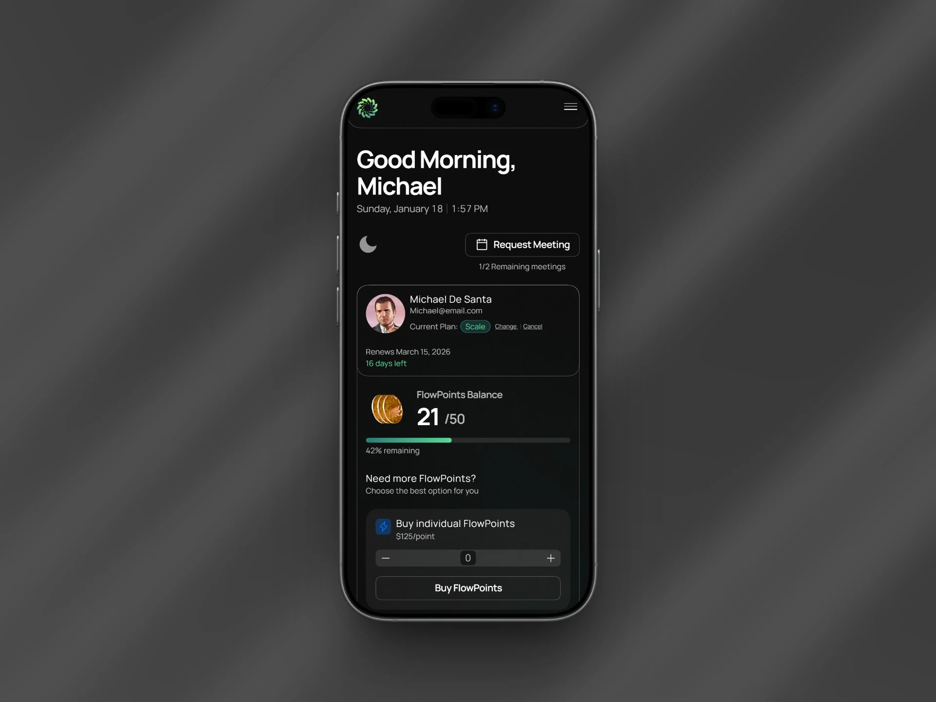
Design in Flow's original dashboard felt outdated and confusing. Users couldn’t easily track their FlowPoints, and important data was buried under poor structure and weak visual hierarchy. The platform needed a clean, intuitive interface that felt modern and user-focused.
My Role
I worked inside Framer's design pages and built out two full dashboard concepts, each taking a different angle on how the information could be structured and surfaced. Both came with mobile versions, because a dashboard that only works on desktop in this era isn't really done. Every layout decision, every component choice, every hierarchy call was made with one question in mind: does this make the user's life easier, or is it just there to look good?
FlowPoints tracking became the north star for the whole redesign. If a user couldn't land on the dashboard and immediately understand where they stood, the design had failed.
So I made sure it didn't. The data that mattered most got the space and weight it deserved. The noise got cut. Structure became something you could feel when you used it, not something you had to figure out.
And through all of it, I made sure I followed Design In Flow's branding, because handing a client an interface that looks nothing like their identity defeats the whole point. The redesign needed to feel like them, just a much better version.
The Results
Design In Flow walked away with two fully polished dashboard concepts, each with desktop and mobile versions that are ready to hand off or build from.
FlowPoints tracking went from buried and confusing to the clearest thing on the screen. The interface finally matched the quality of the brand behind it, and Design In Flow had a foundation they could actually build on and they were extremely happy with the final design!
Let’s build your website next!
Choose your preferred way to connect